
ON THE TABLE: HEUER CARRERA 1553N
- Apr 30, 2023
- 5 min read
Updated: May 11, 2023

what colour captivates your dreams?
For me it was a combination of yellow, pink and sky blue shades. A bit like the cover of the Beatles’ 1967 psychedelic rock album Sgt. Pepper, but without George Harrison in his red outfit. The illustrious album cover depicts cardboard cutouts of renowned characters such as Edgar Allan Poe, Marilyn Monroe, Karl Marx, Bob Dylan, Albert Einstein, and Marlon Brando alongside the four Beatles - Paul, John, Ringo, and George - who stood out as the album cover's focal points of course.
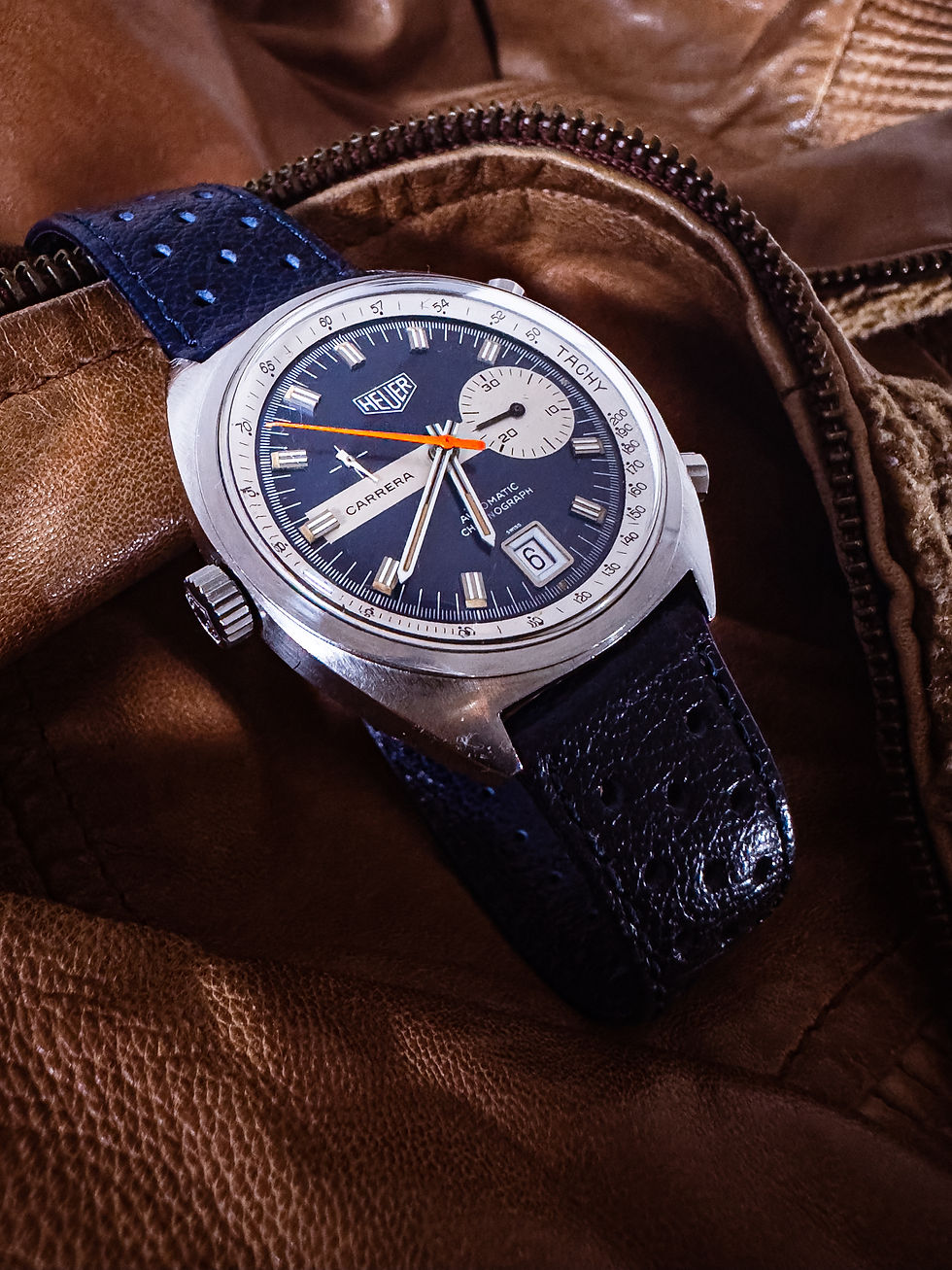
The example of a timepiece we have today also has some unique and interesting characteristics - including its case and dial, but the viewer's attention will undoubtedly gravitate to the chronograph center hand. Is it intentional? Perhaps.

it's that bright orange chronograph hand
At a quick glance, one might initially be drawn to the striking orange chronograph center hand. However, it would be remiss to overlook the case and dial details along with the characteristics they project.
While there are metallic accents - including on the chronograph counter at 3 o’clock, inner bezel tachymeter indicator and hour markers - the dial on this timepiece is mostly covered by a dominant dark blue background. One has to fully appreciate the contrasting metallic accent to experience the calming ambiance created by the dark blue dial.

That calming environment quickly fades away as the bright orange chronograph ticks. My first reaction to that: “the centre chronograph hands seem to be out of place?”. The more I observe, the more I believe that the bright orange chronograph hand was intentionally designed, not only to project a fun, vibrant and energizing element, but also to provide a stark contrast and re-focus the viewers attention away from other colour configurations on the dial.
After all, the first automatic chronograph was released just around that time - Heuer Monaco and Zenith El Primero in 1969 - and what would be a better way for Heuer to showcase it other than putting the main attention to the chronograph hand? I think that may be a fair hypothesis if we put into perspective that this is a brand that was heavily involved in time tracking during the height of the motorsport scene in the 1970s.
tonneau retrofuturism
While tonneau-shaped watches weren't the most popular during the 1970s, it was exceedingly common to be found on chronographs and dive watches from the early 1970s. In this particular example, the exciting colour configuration on the dial is housed within a bold tonneau shape case. Moreover, the oval composition of the brushed tonneau shape is further enhanced by the curvature form of the case when viewed from the side.
Likely driven by retrofuturism popular during the 1970s, there is a strong combination of rectangular and curvature form throughout the shape design. For example, the thick flat case back provides a contrasting form to the curved case - similar to that of vintage Omega Constellation and other models that adopt similar design language from that era. Fuelled by excitement around rapidly changing technology and new emerging innovations in that era, retrofuturism application to design language was also prominent in architecture, interior, car, fashion - or anything basically from that era.

a view from the side
The winding crown on this timepiece is positioned on the left side due to its Automatic Caliber 15 movement characteristics which similar to its predecessor - The Calibre 11 - was based on a modular concept with a mounted chronograph mechanism, with necessary modification to the position of the winding crown. Not originally designed as a “destro” model, the placement of the crown on the left side was marketed in the Heuer Monaco 1969 ad as a reminder that this chronograph needs no winding. This may be a good example of turning technical limitations into a great product marketing.
Other small but noticeable details on this timepiece includes hexagonal shaped chronograph pushers that has a different shape and form compared to the round shaped winding crown. Flip the watch around and there is nothing much noticeable other than the “sei tacche”, or six notches case back commonly found in wide array of watches from this era.

it looks much bigger than 39mm
Despite being only 38.5mm in size, the dial seem spacious compared to other chronographs of the same size. I was at a Rolex authorized dealer in Texas last month talking to a sales associate who did not believe when I said this watch is 39mm. “This looks much bigger than a 39mm watch”. My first thought would be to attribute this to the thin bezel design, which made the dial look spacious. As I thought more into this, I'm starting to realize another design element on the dial: the metallic keyhole mark on the dial. This horizontal stripe design between the chronograph counter towards nine o’clock helps create a sense of space on the dial. In contrast, its predecessor - Heuer Carrera 1153 - looked a lot more busy with an hour chronograph register at nine o’clock.
Other small details to point out are the double hours markers with tritium lume plots on the edges, which has patinated well along with the luminous hour and minute hands. In this very example, the brown patina on the hour markers complements the orange chronograph hand very well.

asymmetrical elements
While there seems to be a strong and consistent symmetrical retrofuturism accent throughout the case, we probably don’t need a loupe to notice a certain deviation from that design language on the dial. For example, having only one sub dial at three o’clock with the “CARRERA” text at the counter opposite provides an interesting asymmetrical configuration. In addition, a small running second register at ten o’clock adds even more daring asymmetrical feel to the dial. This is a different dial configuration compared to its predecessor, which has two chronograph sub dials placed symmetrically.
I wonder if the symmetry of the dial was not the primary focus of the design? or did the “CARRERA” text at nine o’clock really signify a huge importance for Heuer at that time that it deserves to occupy a prominent space on the dial?

racing provenance
As a devoted follower of horology, I get excited whenever an auction catalogue becomes available. When this particular timepiece was listed by a British auction house as part of their charity auction, I had to do my research and due diligence. To be honest, I have seen other similar timepieces in better condition, but what pulled the trigger for me was the provenance.
The watch was previously part of the collection of a former German race car driver, and from the wear throughout the case and crystal, it seems to have been loved and used heavily by the previous owner. I wouldn't be surprised if the watch was actually used during a racing session.

When it arrived, the watch came with a standard black leather replacement strap with the auction house brand embossed on the inner leather. I thought it made more sense to pair this watch with a dark blue italian racing leather strap to match the dial colour, and as a tribute to the previous owner.
This strap combination probably reflects best what the excitement of the 1970s racing era would feel like, and no brand other than Heuer best represent the motorsport scene back then. This strap selection also ensures that the bright orange chronograph hand remain the focal point of this timepiece.
Recently, the bright orange colour is what comes into mind when I ask myself what colour captivates my dream. Maybe it was the spirit of George Harrison? Despite his technical flair and brilliant contribution to some of the best Beatles song, some say he was the unique fit in the group, like the bright orange chronograph hand in this beautifully aged vintage timepiece.
Comments